Essenza Brand Identity
Timeline
4 weeks
Overview
Let's talk about Essenza
In modern interior design, reusing old furniture is a smart, eco-friendly trend. Rather than discarding worn pieces, customers can repurpose them as unique accents in their homes. Embracing this shift, Essenza launched a network of regeneration warehouses in major cities. The brand specializes in modular furniture that’s both functional and sustainable. Each piece is designed to maximize usability while reducing waste. Essenza brings fresh character to spaces with care for the planet.
Essenza is a chain of furniture store which using modular objects to create smart furniture products. "Essenza" is more than just a brand ‘s name . It carries multiple layers of meaning, reflecting the brand’s mission.
Essence – Brand focuses on a complete experience, where design and functionality meet customers' needs.
Soul – Homes have souls, and furniture brings them to life. Essenza’s smart modular designs create warmth, making every return feel like home.
Spirit – Beyond furniture, Essenza nurtures lasting, positive values for both customers and the community.
Visual Direction
Logo concept
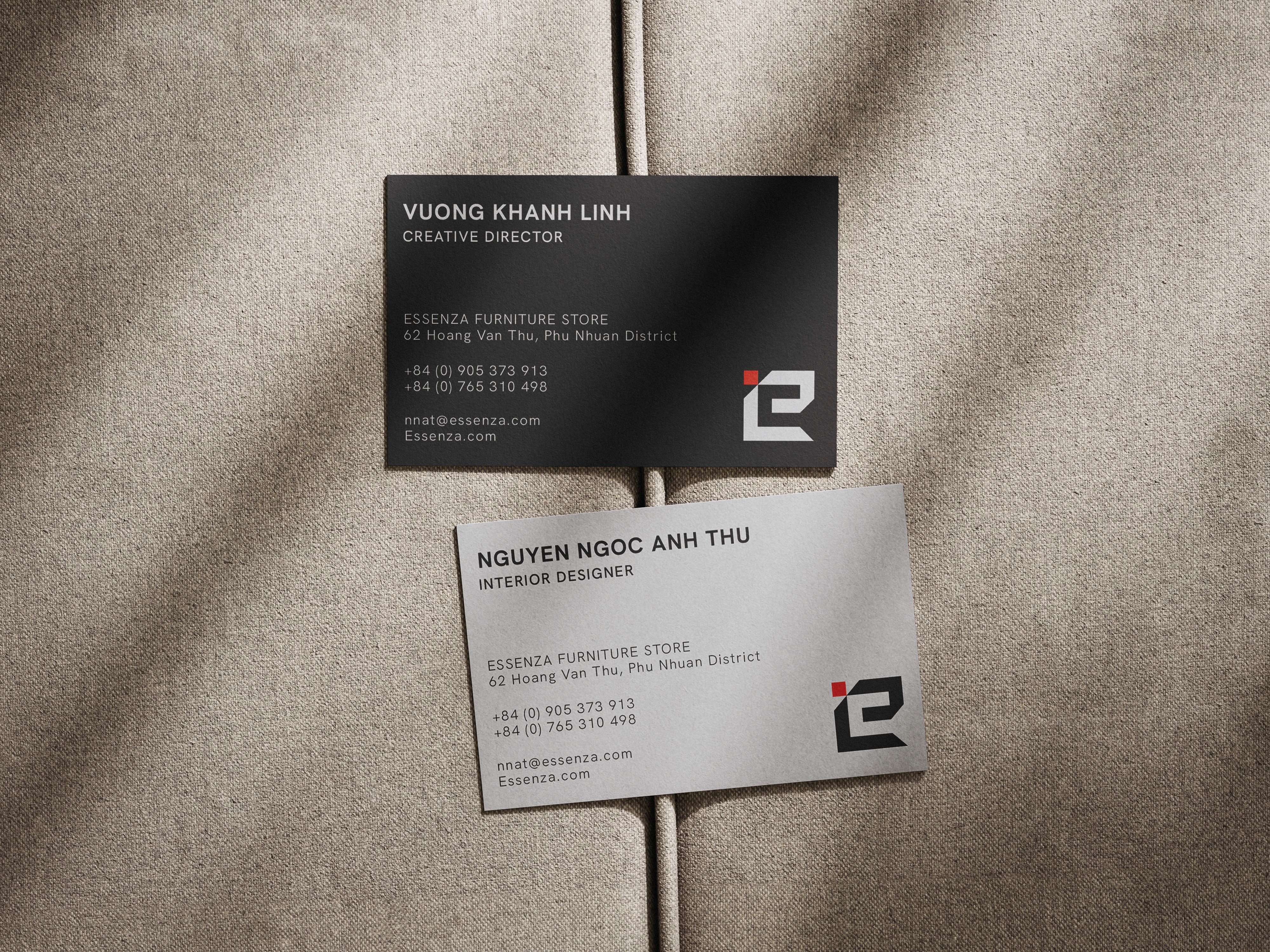
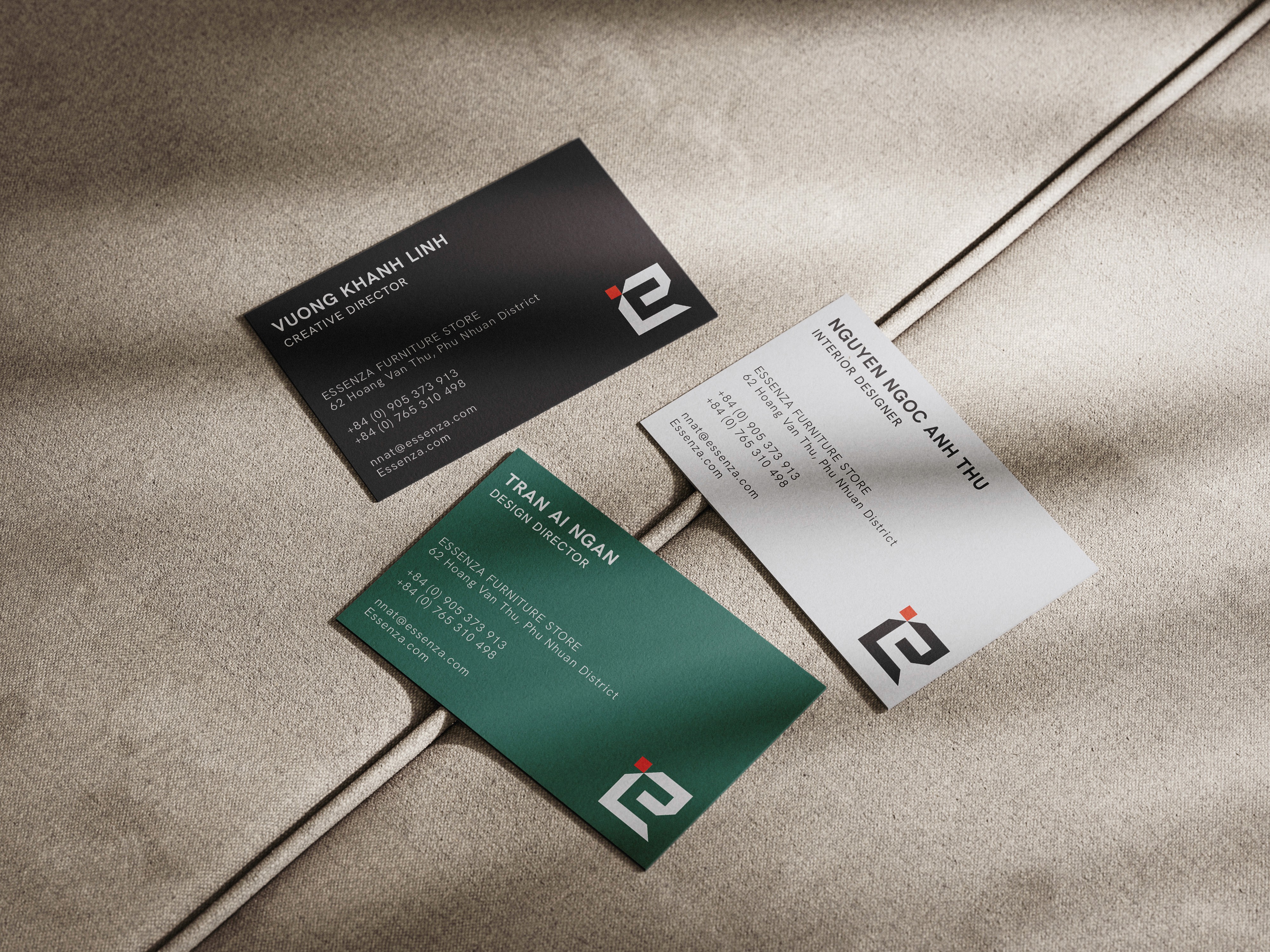
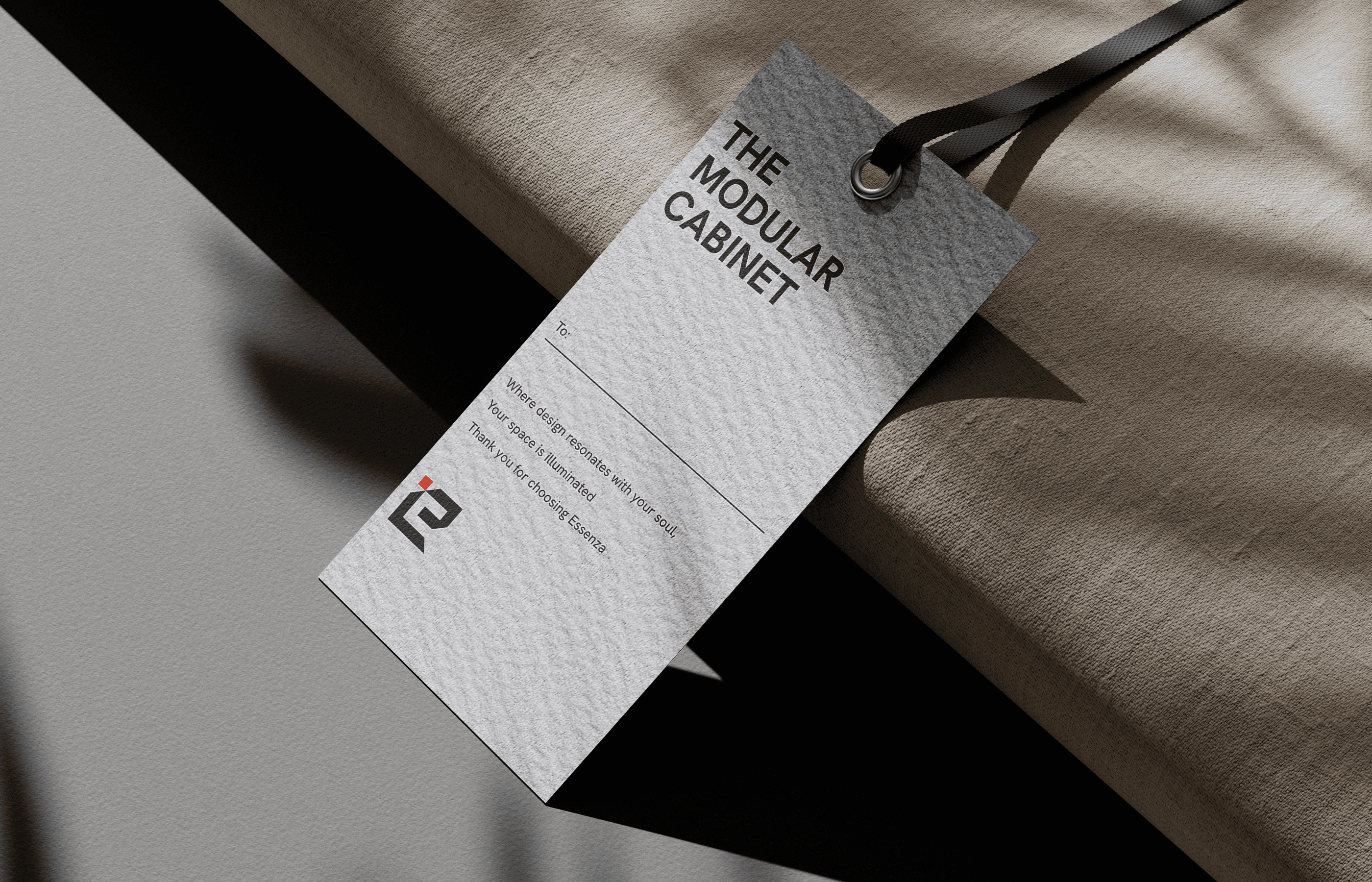
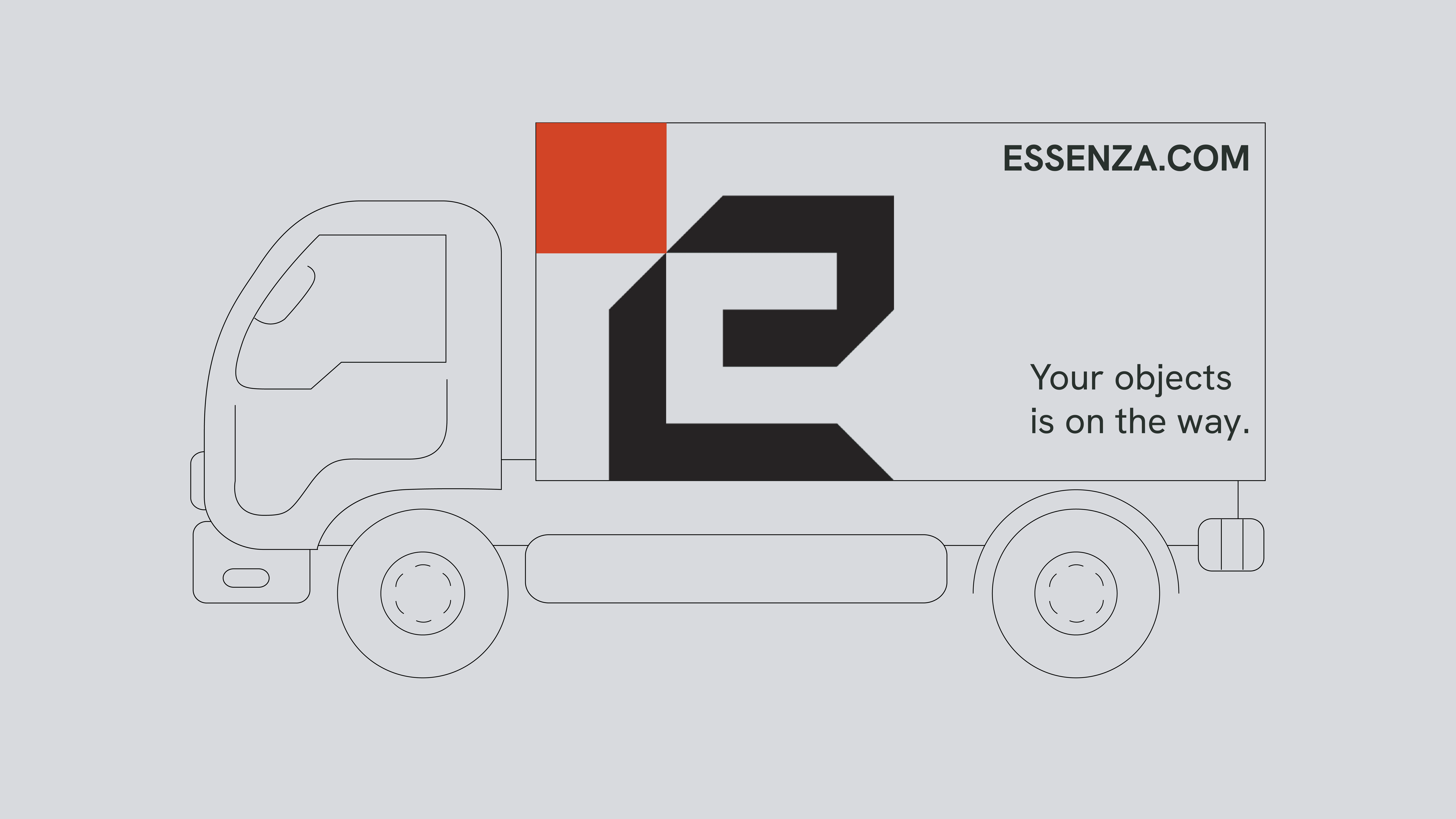
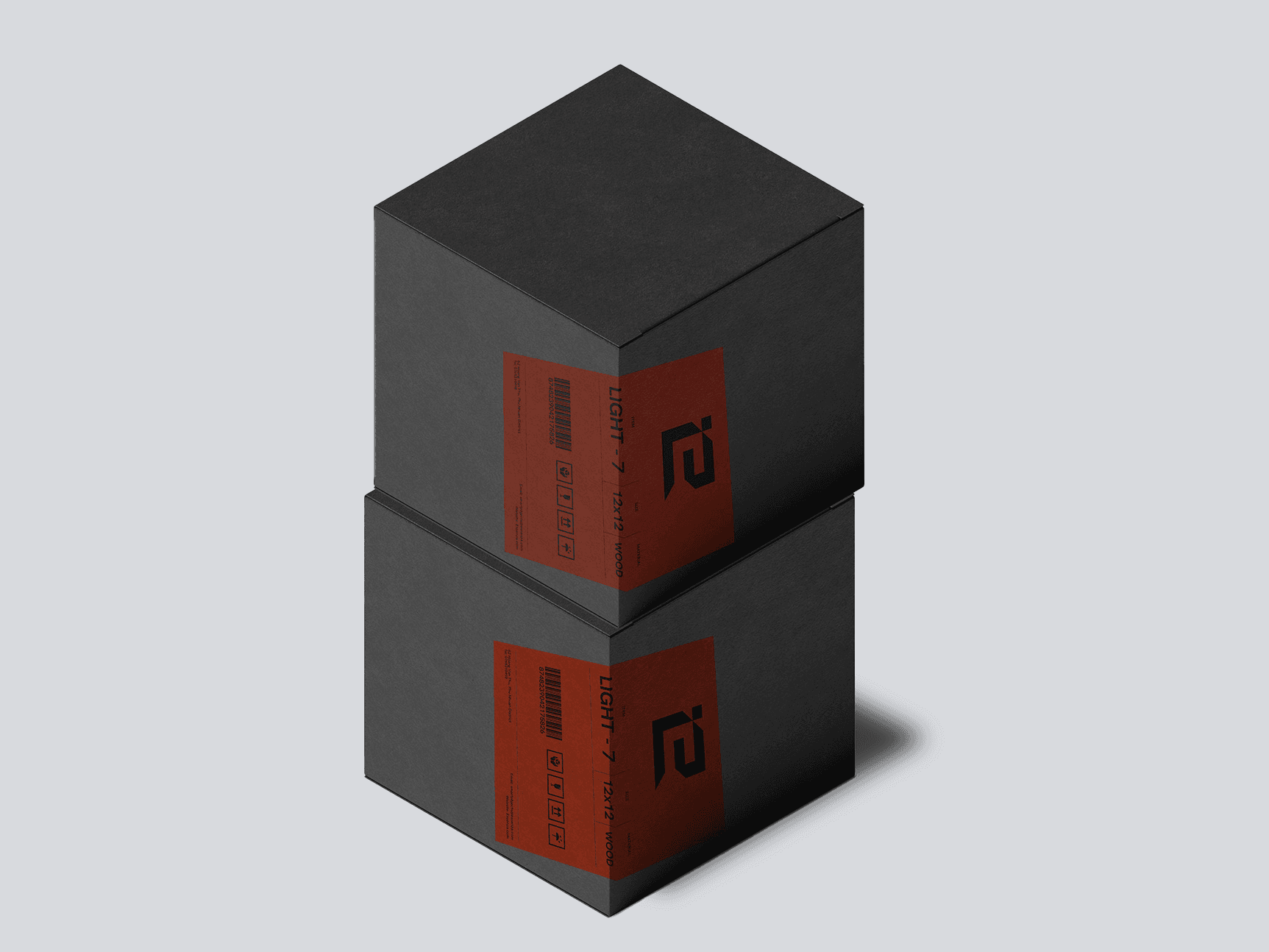
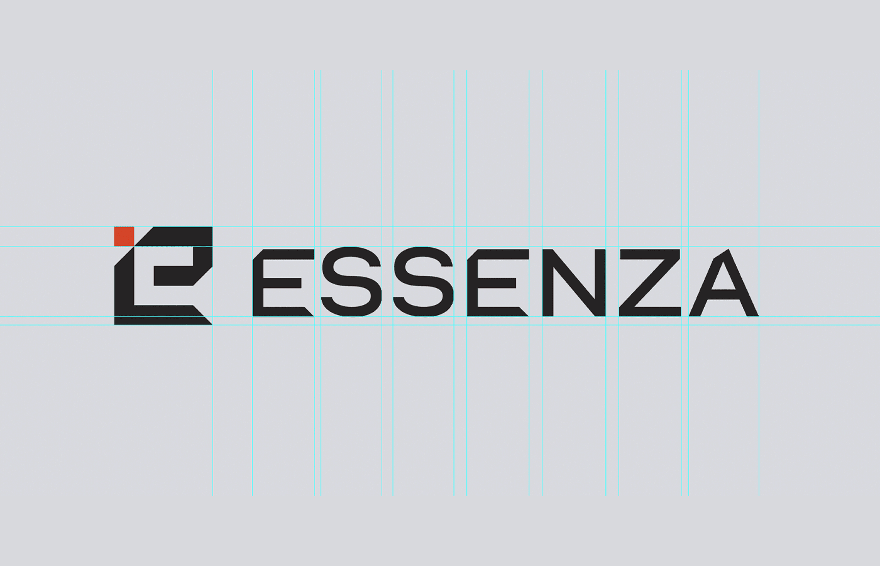
While logo using abstract 'E' represents 'Essenza' and the orange square in the top left corner serves as a striking focal point, symbolizing a modular furniture component and illustrating how individual pieces come together to form a complete object.

Color & Editorial
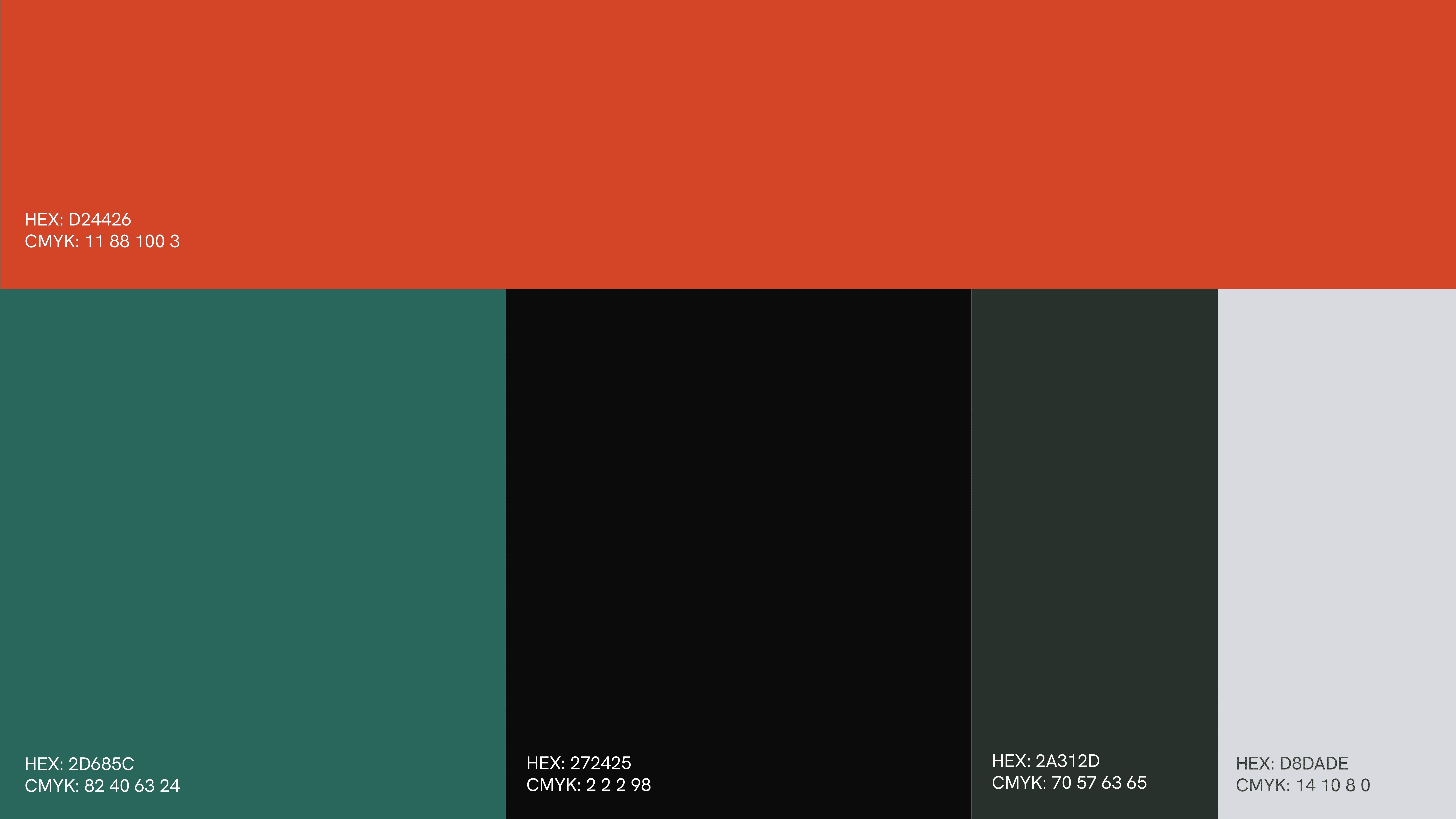
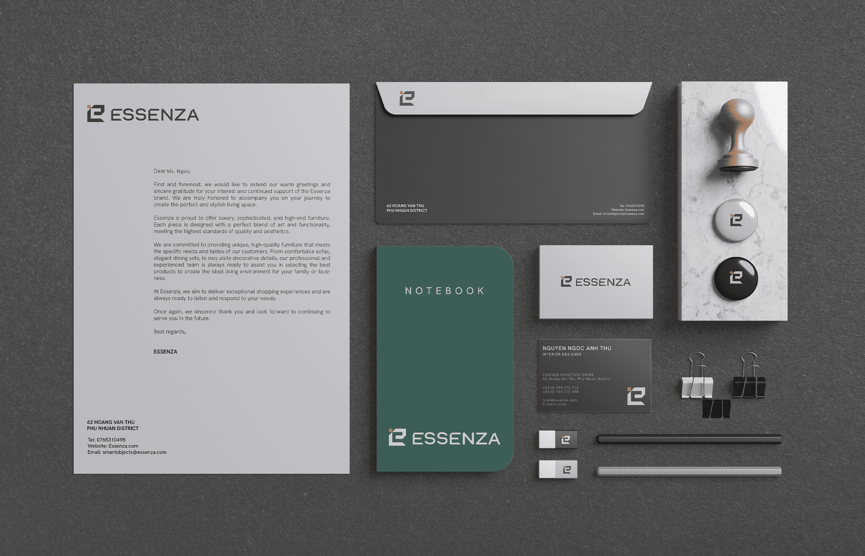
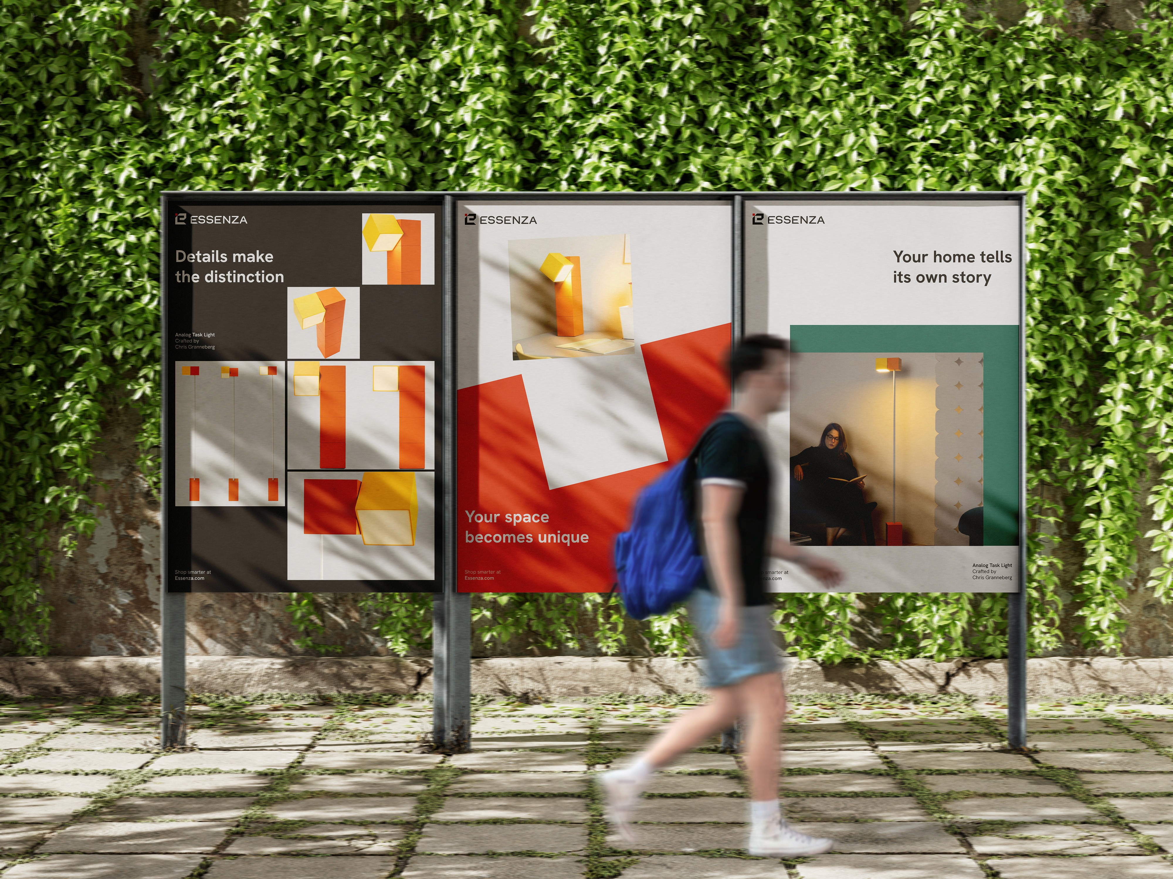
The brand identity uses green & orange as the primary color, so when the consumers look at the identity, they can feel the personalities of brand: creativity, enthusiasm, reliability & sustainability, which make eye-catching packaging but friendly service Swiss design with modular grid also emphasized the concept of brand’s product and make multifunctional feature be visualized and stand out.